Landscaping (Concept Project) Website Design & Development Portfolio
Bringing Their Services Online By Creating The Customised Website
Cynergy Public Adjusting LLC is a trusted name in insurance claim advocacy, offering expert services to policyholders. They specialize in maximizing claim settlements for property damage due to fire, water, storm, or other perils. With a team of skilled adjusters, they ensure fair compensation and seamless claim handling, alleviating stress for their clients.
From Vision To Reality How We Brought Them Online
Planning
Gathered all of the information and understood the business goals and target audience. Researched the public adjusting industry to identify best practices.
Development
Create the custom website design, and develop the CMS. Also, we have tested the website to ensure that it is functioning properly.
Deployment
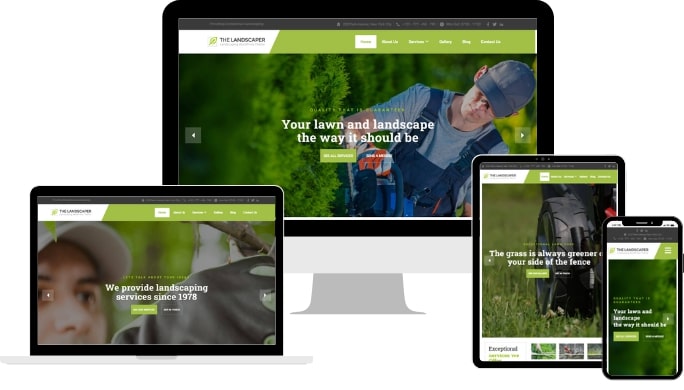
Tested the website on different browsers and devices to ensure that it is compatible with all major platforms. Deployed the website to the live web server.
Maintenance
Provided ongoing support for the website. Regular updates to the website content and design were made as well as resolving any technical issues that may arise.
4
Team Members
Developers
Designers
Content Creator
Client Manager
10-15
Days Timeline of Unstoppable Work
4
Tools Used
WordPress
Elementor
Custom CSS
Custom Header & Footer
Beyond Aesthetics Colours that Speak
Crafted an exquisite design, resulting in a sophisticated and visually appealing website that beautifully reflects their expertise in landscaping services.
Primary Colour
#9FC612
The blue colour used throughout the website represents the primary brand identity. It appears in elements like buttons, links, and certain accents.
Background Colour
#FFFFFF
The light white background colour creates a clean and modern look, offering a subtle contrast to the text colour and providing a pleasant visual experience for users.
Text Colour
#9A9A9A
The dark grey text colour ensures legibility and readability across the website's content, providing a high contrast against the background colour.
Secondary Colour
#464646
The secondary colour adds pops of vibrancy and visual interest, accentuating certain elements and calls to action.
UI Design Visual Composition
Take a look at the different screens, once we have developed the whole website.
Thank you for Scrolling
After carefully examining the case study, you might have got an idea about how we work. Let's talk about your project!